Google Messages Beta Introduces Redesigned Gradient App Icon
Google Messages is adopting a new gradient icon redesign in its latest beta release. The change aligns the primary Android texting application with Google's broader aesthetic overhaul across its mobile ecosystem.
 Radwan AbdulhadiEditor and technology writer
Gradient Icon Redesign Lands in Google Messages Beta
The default messaging client for Android is officially adopting Google's modern gradient visual language, with a redesigned application icon making its initial appearance in the latest pre-release software build. According to reporting on the change, standard text communication hub
The default messaging client for Android is officially adopting Google's modern gradient visual language, with a redesigned application icon making its initial appearance in the latest pre-release software build. According to coverage on the update, Google Messages is joining a growing list of first-party applications receiving a visual refresh designed to unify the software suite across mobile devices.
The updated graphic was discovered inside the open beta version of the app, identified by build string messages.android_20261030_00_RC00.phone.openbeta_dynamic. While the altered branding is currently limited to users participating in the pre-release testing program, its presence indicates that a comprehensive release for general Android device owners is anticipated in the near future.
Visual Adjustments and Color Palette Changes
The newly updated graphic maintains the core recognizable speech bubble aesthetic long associated with the platform, while introducing notable lighting and color adjustments across the icon face. The revised asset clearly shares stylistic elements with the gradient design established for Google Chat, providing aesthetic harmony across the company's messaging platforms.
In terms of color composition, the familiar primary hues have been modified to incorporate a distinct purple color embedded within a dynamic gradient glow section. In addition, the color scheme relocates the darker blue shade toward the back layer of the artwork. This structural layer change produces a fresh gradient effect that adds depth and emphasis to the icon surface.
An Ecosystem-Wide Transition Driven by AI Design
This graphic update forms part of a continuous, multi-stage initiative by Google to refresh its application icons over the past year. Spurred largely by the company's ongoing artificial intelligence focus, the aesthetic transition originally
This graphic update forms part of a continuous, multi-stage initiative by Google to refresh its application icons over the past year. Spurred largely by the company's ongoing artificial intelligence focus, the aesthetic transition originally started with Workspace apps before expanding to diverse consumer services and hardware companion applications.
Following that initial deployment, Google integrated gradient styling into dedicated financial tools such as
Following that initial deployment, Google integrated gradient styling into dedicated financial tools such as Wallet as well as hardware management applications like Pixel Buds. The broader movement continues across native phone software, with Google rolling out gradient icon redesigns for Contacts, Messages, and Phone to ensure primary call, message, and contact tools maintain a modern, cohesive look.
Beta Availability and Rollout Expectations
At present, the newly styled logo remains exclusive to the Android open beta distribution path. Users enrolled in the Google Messages beta track who update to build messages.android_20261030_00_RC00.phone.openbeta_dynamic will see the gradient artwork across their device home screens, app drawers, and system notifications.
Google typically validates visual changes and interface updates within pre-release testing builds prior to initiating broader deployment. Given that the gradient icon is fully integrated into the latest testing build, the redesigned application mark is expected to make its way onto the stable release track shortly after standard pre-release evaluation is completed.
Recent Feature Evolution in Google Messages
The introduction of the gradient icon comes during an active period of functional feature updates for the application. Alongside cosmetic enhancements, developer teams have been deploying practical security and interface utilities designed to refine daily communication.
For instance, security capabilities have been expanded with
For instance, security capabilities have been expanded with Google Messages rolling out Enhanced Protection mode against spam and scams to better protect users from suspicious content. On the usability front, recent updates include Google Messages rolls out new long-press menu with partial copying for granular text selection, as well as Google Messages rolls out new swipe for timestamps & reply gesture to streamline everyday conversational navigation.
Sources
- 9to5GoogleGoogle Messages update rolling out new app icon with gradient design
Continue chronologically


Related entity coverage
Related stories
Android Introduces Gemini AI Defenses to Google Messages
Google is bringing cloud-based Gemini AI models and on-device features to Android devices to help users evade mobile fraud and detect scams.
Google Messages Rolls Out Enhanced Protection Against Scams
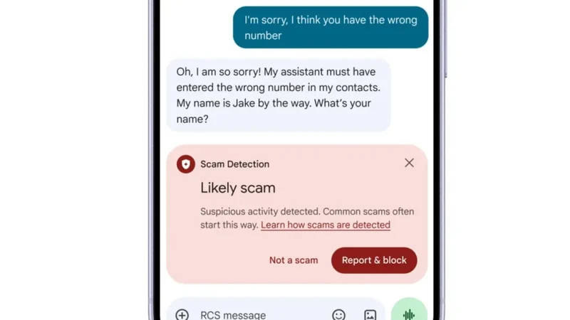
Google Messages for Android is rolling out an Enhanced Protection mode featuring cloud Gemini models and Private AI Compute to counter scams.
Google Details Android October 2026 System Updates
Google details the October 2026 system updates, bringing new features to Play services, the Play Store, and various Android devices.
Google Details Android System Updates for October 2026
Google has released its monthly Android System Release Notes for October 2026, detailing new features for Play services, Wallet, and more.