
Inside Cloudflare Radar’s Redesign: Interactive Maps and Tabbed Data
The platform's recent overhaul balances deep technical metrics with an intuitive user experience tailored for journalists, researchers, and everyday users.
 Radwan AbdulhadiEditor and technology writer

Expanding Access to Global Internet Trends
Since launching in 2020, Cloudflare Radar has provided real-time visibility into global Internet trends, powered by Cloudflare's extensive global network. While the platform quickly found a natural audience among expert users with technical backgrounds—such as network operators and academic researchers who rely on its data to track global events—its potential as a self-serve resource for journalists, human rights advocates, policymakers, and everyday users remained constrained by its interface.
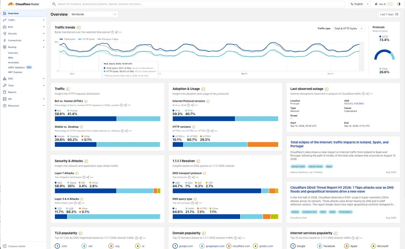
To address this, the team reevaluated the user experience to make the platform more approachable to broader audiences while preserving the technical depth and rigor expected by power users. According to the development team, the previous landing page successfully displayed the breadth of the data, but the layout made the information difficult to parse quickly.

Addressing Layout and Navigation Challenges
The prior bento box layout gave all elements similar visual weight, while vertical cards disrupted natural reading patterns and styling felt disconnected from Cloudflare's broader brand. External feedback reinforced these issues, with users noting that the platform could feel intimidating to newcomers and difficult to demonstrate in educational settings.
Consistency in design directly affects trust and usability for external users. A more cohesive experience signals that the platform is an authoritative source, while familiar layout patterns reduce the cognitive effort required to process complex information.
Introducing an Interactive Map and Tabbed Flow
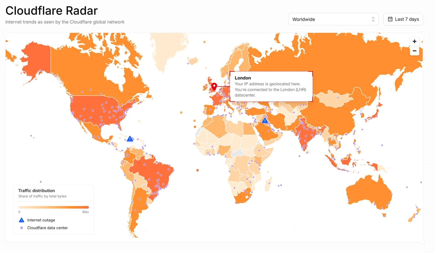
To solve these navigation hurdles, the revised platform centers around a visual reference familiar to users of all backgrounds: a map. Although the Internet often operates independently of national borders, its real-world relevance is frequently understood best through geography. The top section of the updated interface highlights traffic and outages, leading with outages due to their timely and salient nature.
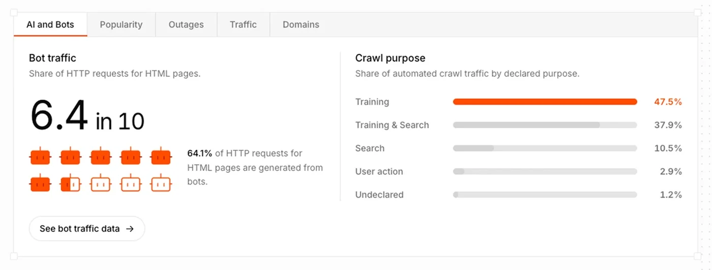
Below the map, the development team replaced the old bento box chart widgets with a structured, tabbed flow. These tabs provide summary statistics to highlight the platform's capabilities while offering clear calls to action for deeper data exploration.
Adopting Unified Design Standards
In developing the new design language, the team evaluated Cloudflare's broader content ecosystem, ultimately positioning the tool at the intersection of marketing approachability, content structure, and technical product maintenance. To achieve consistency and maintainability, the platform migrated to Kumo components utilized across Cloudflare's product system.
The map itself underwent numerous iterations to strike the correct balance between data richness and approachability. Early versions proved too dense with data-heavy visuals, while later variants leaned too far toward static marketing styles. The final implementation aims to capture the feel of live data while remaining readable.
Future Outlook and User Feedback
Because Cloudflare sits in front of roughly 20 percent of all web traffic, the platform is positioned to share unique insights spanning security, performance, and traffic. This redesign serves as a foundational step toward more intuitive tools and visualizations designed to remove friction for newer audiences.
As the team continues refining the platform, they are actively encouraging user input. Feedback can be shared via social media channels such as @CloudflareRadar on X or the radar.cloudflare.com presence on Bluesky, allowing the community to help shape future updates.
Sources
- Cloudflare BlogBridging technical depth and usability: The story behind Radar’s redesign
Continue chronologically


Related entity coverage
Related stories
Cloudflare Redesigns Radar to Broaden Data Accessibility
Cloudflare has redesigned its Radar platform to make real-time global internet traffic and outage data more accessible to a wider audience.
Cloudflare Launches Zero Wire for Vulnerability Intelligence
Cloudflare has introduced Zero Wire, a public vulnerability intelligence feed on Cloudflare Radar designed to help security teams triage critical CVEs.

Cloudflare Radar Details Q3 2026 Internet Outages
Cloudflare Radar's Q3 2026 report reveals global Internet disruptions caused by power failures, natural disasters, and government-directed shutdowns.
Cloudflare CEO Matthew Prince Discusses AI and the Web
Cloudflare CEO Matthew Prince talks with The Verge about automated bot traffic surpassing human internet use, AI scrapers, and changing web business models.